Hey there friends! Ann has a beautiful color combination for us over at The Paper Players:
Isn't it pretty?! Makes me think of spring. Too bad it's still winter--even here in Florida! I actually made two card with these colors and ended up liking the second one best.
I also thought this one was more in line with Ann's style and since it is her challenge....well, I thought she might like it! Although, I will admit, I tried to add pearls but couldn't make it work. LOL. Anyway, I really love this single stamp from the new Occasions catalog called Love is Kindness. It's very versatile; I can see using it for Valentine's Day, Easter, spring or even just a special Thank You card as I've done here. The image is stamped in Memento Ink and colored with a combination of Stampin' Write markers, Blender Pens and an Aqua Painter.
There are some water spots courtesy of Gorgeous Grunge and I crumpled the Typeset DSP for a vintage look. I thought you might want to see a close-up of the two different ribbons I used: Lost Lagoon satin and Venetian Crochet. Ahhh.....pretty!
Here, I tried to capture the sparkle for you. I thought the white on the background paper was a little too stark so I spritzed it with a homemade mix of rubbing alcohol and Champagne Mist shimmer paint. The entire background is full of shimmer and shine! The Tea Lace Doily was also quite white so I sponged on some shimmer paint and Sahara Sand ink for a nice, aged look.
The inside is pretty self-explanatory just stamped off to the side so as not to repeat the sentiment. I sponged the edges with more Sahara Sand ink and added some more water spots.
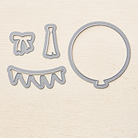
Now, here's the first card I made. A total departure from the second one, right? This one features the popular Bokeh Effect technique. It's really very simple. The Whisper White background piece is sponged with all three challenge colors. Next, I cut a piece of window sheet to serve as a stencil. In this piece of window sheet I die cut two circle shapes--about 1.25" and 3/4". Using Whisper White craft ink, I sponged the circles all around the background varying the intensity of the ink with each one. You want to achieve the look of soft focus lights in the background. Final touches were a vellum balloon, silver baker's twine, Crisp Cantaloupe washi tape (Sweet Sadie) and a sentiment die cut with the Little Letters Thinlits.
So, there you have it. Two cards in one post! Be sure to pop over to The Paper Players and check out all the inspiration from the rest of the Design Team. Then, I hope you will play along with us before the challenge closes on Friday, January 16th at Noon (PST). Thanks for stopping by today!
The Paper Players Design Team


20 comments:
Are you kidding me? I like both cards the colors ARE Spring like, but the second card, be still my heart... plus a new (to me) technique. You certainly achieved the look of backlighting with your stencil and coloring, love the washi tape on the side too, just gorgeous. The first card is lovely too and all the details you did, crumplin', spongin' and stamping very, very nice!
I am with your mom on this one.....wow two gorgeous cards! Love all of the layering and vintage look on #1......and the bokeh effect on #2 is gorgeous girl!
Wow, both your cards are gorgeous Nance, but I adore the one with the bouquet of tulips. So many delicicous layers. That stamp is on its way to me so thank you for the inspiration!
I agree, two pretty spring cards! I'm glad you shared both. I love all the details you added to each one!
Wow! Two fabulous cards - I love the image and "grunge" on the first card and the crisp, fresh look of the second card.
Fabulous and with my favorite flower too :) Great second card as well. Happy New Year to you and best wishes for a fabulous 2015 :)
Nance, wow! Two beautiful cards! I love the tulips and the vintage look, but I also love the bokeh technique! You certainly made this color palette shine with two totally different looks! Just shows how multi- talented you truly are, My Friend! XX
Nance, I dare not even try to pick a favorite from your cards because they both taught me so much! I have got to try the bokeh technique soon! The Love is Kindness just showed up on my doorstep this week so I can't wait to CASE your card with it! TFS
Both these cards are stunning, Nance! Love all the detail in the bouquet card, & the vellum balloon partnered with the negative image sentiment on the bokeh background is just divine. ♥
Both of these are so beautiful! The second one is so unique and creative! Such inspiration!!
Nance I agree with others..they are BOTH gorgeous! Love the first one with the stamp (fav) and the crumpled newsprint... very cool. The double ribbon and doilys and water spots/smuging...well..Vintage.. just surprises me from YOU. You are usually so CAS. But this is beautiful none the less.
The second one is STUNNING! LOVE love love the Bokeh technique but I've yet to attempt it. It seems I'm behind on trying this one which is just everywhere today. YOU have captured this technique like a champ. Beautiful! hugs.
LOL, I had to laugh when you said you were channeling Ann....I think your card looks more like Ann than the one she created this week!!! How fun that you both used the same set and created equally beautiful cards! But I agree with your mom...the second one is amazing and I have that technique bookmarked to try! I was wondering what die you used for the letters...duh, I have those dies myself! Very cool to leave out the "innards"...very trendy, that's you!
Gorgeous cards, Nance! I need to try the Bokey technique.. :)
Nance, your card is sooo pretty! I love all the details and the sparkle but have to admit that the second card, the clean and simple one, is my favorite :) You did a fantastic job with the bokeh effect and have inspired me to try it!! Both cards are beautiful!!
I love both cards too Nance! I find the first one really inspiring, as the whole vintage/shabby chic thing is a look I struggle to create. The second one is lovely - the die cut sentiment over the bokeh is great and the vellum balloon is just enough and adds to the soft feel of this card. I had a go at this style for the first time this week and I really like it -very effective.
Stunning cards!
Nance, I love the heart paper behind your beautifully colored flowers. It works so well with the newsprint, too. Fabulous card
hugs
jaydee
Both of your cards are gorgeous, Nance! Wow! You never fail to inspire me with your gorgeous creations, my friend! :)
Wow!!!!! You hit a homerun with both cards! Love the first card and all of the feminine touches! SO excited to see you join us, Nance.
Hugs,
Lesley
WOW, so glad this sweet stamp is on its way to me!!
CONGRATS!!!!!!!!!!!!!!
Post a Comment